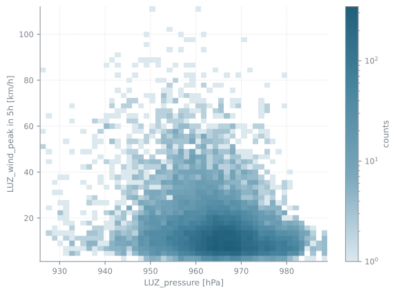
Figure 7.1: Pressure in Luzern against the wind peak five hours later. There is a relationship, but it is not a tight one.
Low pressure goes with high wind, but the spread is large. Even a perfect model cannot predict the wind peak exactly from the pressure alone.
cols = ["LUZ_pressure", "BAS_pressure", "LUZ_sunshine_duration", "LUZ_wind_peak"]short = ["LUZ press.", "BAS press.", "sunshine", "wind peak"]sample = weather[cols].sample(3000, random_state=0)pairplot([sample[c].values for c in cols], short)plt.show()
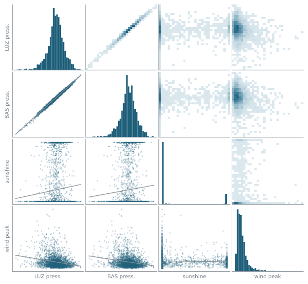
Figure 7.2: Four columns of the weather data against each other: a histogram of each column on the diagonal, a scatter plot with a trend line below it, and a two dimensional histogram above it.
Three things are visible without fitting anything. The wind peak has a long tail: the median is 11 km/h and the largest value in the set is 112. The two pressures are almost the same number twice, with a correlation of 0.995, so one of them carries little information the other does not. And the sunshine duration is zero in 72% of the hours, because it is night for half of them and overcast for many of the rest.
What a pair plot cannot show
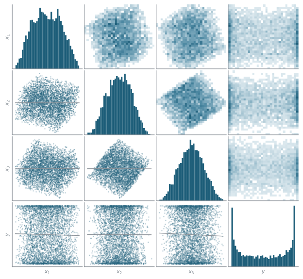
A pair plot can look uninformative even when the predictors determine the response exactly. The data below is artificial: three hidden coordinates \(z_1, z_2, z_3\) drawn uniformly at random, a response \(y = \sin(2\pi \cdot 1.5\,(z_1 + z_2 +
z_3))\) that depends only on their sum, and a random rotation that turns the hidden coordinates into the three predictors \(x_1, x_2, x_3\) we get to measure. Each predictor is a mixture of all three hidden coordinates, so the direction along which \(y\) varies is spread over all of them. There is no noise.
Figure 7.3: The same pair plot as above, on data whose response is an exact function of the three predictors. Every trend line is flat.
Adding products of pairs and triples of the predictors does not help either.
from sklearn.linear_model import LinearRegressionfrom sklearn.preprocessing import PolynomialFeaturesfor degree in (1, 2, 3): P = PolynomialFeatures(degree, include_bias=False).fit_transform(x) r2 = LinearRegression().fit(P, y_toy).score(P, y_toy)print(f"R^2 with every term up to degree {degree}: {r2:.3f}")
R^2 with every term up to degree 1: 0.001
R^2 with every term up to degree 2: 0.002
R^2 with every term up to degree 3: 0.004
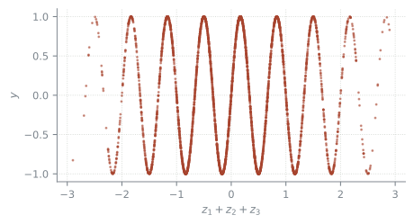
The relationship is nevertheless exact. Plotting the same 4000 points against \(z_1 + z_2 + z_3\) shows it.
Figure 7.4: The same points, against the sum of the three hidden coordinates.
A pair plot shows each predictor on its own and each pair of predictors. Structure that involves three predictors at once, or that follows a direction that is a combination of the measured predictors, does not show up in any of these panels.
Looking at the raw data is necessary. It is not sufficient.