We look for the loadings \(\phi_{11}, \dots, \phi_{p1}\) that maximize \(\frac{1}{n}\sum_i z_{i1}^2\) subject to \(\sum_j \phi_{j1}^2 = 1\).
The \(k\)-th principal component is the direction of largest variance among all directions orthogonal to the first \(k-1\).
Three dimensional data, shown as two of its axes at a time. Each line runs from a point to the plane through the origin perpendicular to the chosen component, so its length is that point’s score. The first component has the longest lines.
The solution is that \(\phi_k\) is the eigenvector of \(\hat\Sigma\) with the \(k\)-th largest eigenvalue.
Turn the direction and watch the variance of the projection. The red segments are the distance from each point to its projection. The first principal component is the angle where the variance is largest, which is also where those segments are shortest.
In matrix notation
With all components at once,
\[
Z = X\Phi,
\]
where \(\Phi\) is \(p \times p\) and its columns are the eigenvectors of \(\hat\Sigma\). The eigenvalue \(\lambda_k\) is the variance along component \(k\).
This is closely related to the singular value decomposition \(X = U S V^\top\), where \(U\) and \(V\) are orthogonal and \(S\) is diagonal. One can show that
\[
\Phi = V \qquad\text{and}\qquad Z = US.
\]
In practice we compute the SVD of \(X\) rather than the eigenvectors of \(\hat\Sigma\). It is more accurate, and it avoids forming a \(p \times p\) matrix when \(p\) is large.
A change of basis
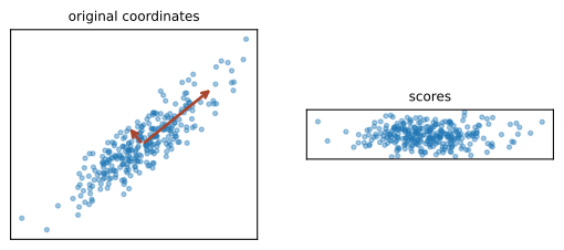
The clearest way to think about PCA is as a rotation of the coordinate system.
size
data
\(X\)
\(n \times p\)
rows are coordinates in the standard basis
loadings
\(\Phi\)
\(p \times p\)
columns are the new basis vectors
scores
\(Z = X\Phi\)
\(n \times p\)
rows are coordinates in the new basis
reconstruction
\(X = Z\Phi^\top\)
\(n \times p\)
back to the standard basis
So far nothing is lost. This is a lossless change of basis.
The reduction comes from keeping only the first \(L\) columns,
Now something is lost. One can show that \(\Phi_L\) is the choice that minimizes \(\|X - X\Phi_L\Phi_L^\top\|_2^2\), so PCA gives the \(L\) dimensional linear subspace that is closest to the data.
These are two different descriptions of the same thing. The directions of largest variance are also the subspace closest to the data.
An example
import numpy as npimport matplotlib.pyplot as pltfrom sklearn.decomposition import PCArng = np.random.default_rng(12)cov = [[3.0, 2.2], [2.2, 2.0]]X = rng.multivariate_normal([0, 0], cov, 300)X = X - X.mean(axis=0)pca = PCA().fit(X)print("loadings (columns are components):")print(pca.components_.T.round(3))print("variance along each component:", pca.explained_variance_.round(3))
1
PCA needs centred data. sklearn centres internally, but it is worth being explicit.
2
sklearn stores the loadings as rows of components_, so we transpose to get our \(\Phi\).
loadings (columns are components):
[[ 0.781 -0.625]
 [ 0.625  0.781]]
variance along each component: [4.009 0.267]
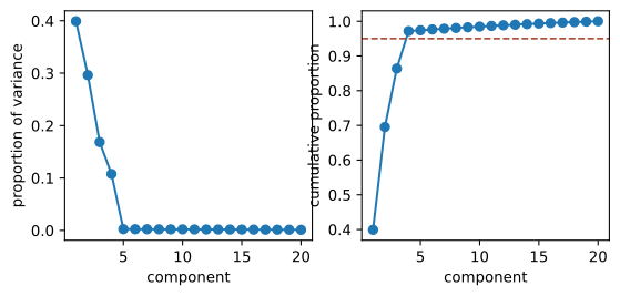
There is an elbow after four components, which is how the data was generated. The elbow method is to look for the point where the curve flattens. It is a judgement, not a rule.
Scaling matters
PCA maximizes variance, and variance depends on units. A predictor measured in millimetres has a variance a million times larger than the same predictor in metres, and it will dominate the first component.
without scaling: [1. 0. 0.]
with scaling:    [0.3838 0.3383 0.278 ]
Without scaling, the first component is almost entirely the third column.
Standardize before PCA, unless all columns are already in the same units and the differences in variance are meaningful.
Biplots
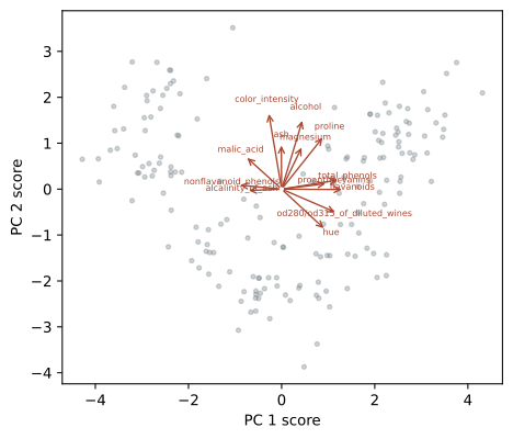
A biplot shows the scores and the loadings in the same figure. The points are the observations in the new coordinates, and the arrows show how each original variable relates to the components.
Figure 63.3: A biplot. Arrows that point the same way belong to variables that are correlated.
Two arrows that point in the same direction belong to variables that are correlated. An arrow at right angles to another means the two are uncorrelated. A long arrow means the variable is well represented in these two components.