A linear model is linear in its features, not necessarily in the raw inputs. Every section on this page builds features \(h(x)\) from the inputs, as the polynomial features of week 3 did, and fits a linear model on them.
Categorical predictors
A model cannot use the string "female". One-hot coding turns each category into its own column of zeros and ones.
With an intercept in the model, one of the columns per category is redundant. The sum of all columns of one category is always 1, which is the intercept again. Without a penalty this makes the least squares solution non-unique, so we drop one column per category. With a penalty, as in ridge regression, the redundancy does no harm and all columns are usually kept.
The 1985 CPS wage survey, 534 people, the same data set the panel below uses. select_dtypes("category") finds the columns that need encoding instead of naming them by hand.
2
A category that never occurred in the training data is encoded as zeros in all its columns, instead of stopping with an error. In cross-validation this happens whenever a rare category is missing from the training folds.
predictor
coefficient
0
SOUTH_yes
-0.563
1
SEX_male
1.943
2
UNION_not_member
-1.602
3
RACE_Other
-0.231
4
RACE_White
0.607
5
OCCUPATION_Management
3.268
6
OCCUPATION_Other
-0.022
7
OCCUPATION_Professional
1.935
8
OCCUPATION_Sales
-0.796
9
OCCUPATION_Service
-0.707
10
SECTOR_Manufacturing
0.563
11
SECTOR_Other
-0.477
12
MARR_Unmarried
-0.301
13
EDUCATION
0.813
14
EXPERIENCE
0.245
15
AGE
-0.158
Read a coefficient as the effect of that predictor with all the others held fixed. Years of education correlate positively with wage; a woman earns about 2 USD per hour less than a man with the same education, experience and occupation; someone in management earns about 4 USD per hour more than someone in sales.
The encoder is a step of the pipeline, so in cross-validation it is fitted inside each fold. Every transformation on this page goes into a pipeline the same way.
Interactions
In the model above, a year of education is worth the same for everyone. The product of two predictors lets the effect of one depend on the other.
A year of education adds about 0.68 USD per hour for men and 0.17 more for women. The cross-validated error does not improve, though: on 534 people the difference in slopes is too small to pay for the extra parameter. PolynomialFeatures(interaction_only=True) builds all pairwise products at once.
Splines
A spline is a piecewise polynomial, joined at a set of knots. The basis is the powers of \(x\) up to the degree, then one hinge \(\max(0, x-k)^{\text{degree}}\) per knot.
def spline_features(x, degree, knots):"""Columns x, x^2, ..., x^degree, then one hinge per knot.""" cols = [x ** d for d inrange(1, degree +1)] cols += [np.maximum(0, x - k) ** degree for k in knots]return np.column_stack(cols)age = wage["AGE"].to_numpy(dtype=float)H = spline_features(age, degree=3, knots=[30, 40, 50, 60])print("one column per power, one per knot:", H.shape)
one column per power, one per knot: (534, 7)
Fitting wage against age on that basis is ordinary least squares again.
Wage against age on the 1985 CPS data, fitted on the spline basis above, with the degree and the four knots on sliders. The fit is redone in the browser each time.
Wage rises steeply through the twenties, flattens through the forties and turns down after sixty, which no low degree polynomial does. A knot placed where the curve is already flat changes almost nothing; the knots that matter are the ones where the slope changes.
In practice, SplineTransformer builds the basis. It uses B-splines, which span the same functions as the powers and hinges above but are far better conditioned, and it places the knots at quantiles of the data.
from sklearn.preprocessing import SplineTransformerspline = Pipeline([("basis", SplineTransformer(n_knots=6, degree=3)), ("regressor", LinearRegression())])spline.fit(wage[["AGE"]], wage["WAGE"])print("columns of the basis:", spline[0].transform(wage[["AGE"]]).shape[1])
columns of the basis: 8
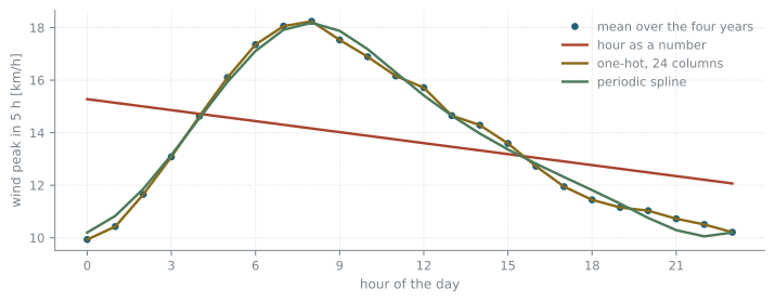
Some inputs are periodic. The hour of the day runs from 0 to 23, and hour 23 is next to hour 0. A periodic spline has the same value and slope at both ends. We predict the Luzern wind peak five hours ahead from the hour of the day alone, three ways.
time is written as YYYYMMDDHH, so the last two digits are the hour.
2
The wind peak five hours after each row, as in week 1.
hour as a number       cross-validated RMSE 10.303
one-hot, 24 columns    cross-validated RMSE 9.990
periodic spline        cross-validated RMSE 9.985
The hour as a single number forces the wind peak to rise or fall steadily through the day and jump back at midnight. One-hot coding and the periodic spline both follow the daily cycle and reach the same error; the spline does it with a smooth curve and fewer parameters.
drawing the three fits
import matplotlib.pyplot as plthours = pd.DataFrame({"hour": np.arange(24)})fig, ax = plt.subplots(figsize=(8.8, 3.0))ax.plot(hours["hour"], pd.Series(peak).groupby(hour["hour"].to_numpy()).mean(),"o", label="mean over the four years")for name, model in models.items(): ax.plot(hours["hour"], model.fit(hour, peak).predict(hours), label=name)ax.set(xlabel="hour of the day", ylabel="wind peak in 5 h [km/h]", xticks=range(0, 24, 3))ax.legend()plt.show()
Figure 23.1: The mean wind peak five hours ahead, against the hour of the day, and the three fits.
Transforming the output
Sometimes the response itself is the problem. It may be reasonable to transform the output such that its distribution is closer to normal. Another reason is an output that is strictly positive and has strong outliers above the mean: a linear regression is pulled towards the outliers and can nevertheless predict negative values.
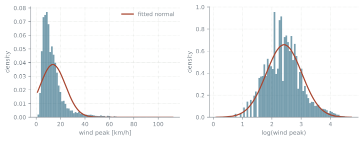
The wind peak in Luzern is such a variable. Its distribution is far from normal; its logarithm is much closer.
Figure 23.2: The wind peak and its logarithm, each with the normal distribution fitted to it.
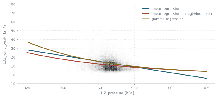
There are two ways out. We can take the logarithm of the response, fit a linear model and take the exponential of its predictions. Or we can keep the response and change the noise model, for example to a Gamma distribution. Here all three predict the wind peak from the pressure in Luzern.
from sklearn.linear_model import GammaRegressorfrom sklearn.preprocessing import StandardScalerX, y = weather[["LUZ_pressure"]], weather["LUZ_wind_peak"]linreg = LinearRegression().fit(X, y)loglinreg = LinearRegression().fit(X, np.log(y))gamreg = Pipeline([("scaler", StandardScaler()), ("regressor", GammaRegressor(alpha=0))]).fit(X, y)for name, pred in [("linear", linreg.predict(X)), ("linear on log(y)", np.exp(loglinreg.predict(X))), ("gamma", gamreg.predict(X))]:print(f"{name:17s} mean prediction {pred.mean():6.2f}")print(f"{'data':17s} mean {y.mean():6.2f}")
1
GammaRegressor is fitted by gradient-based optimization, which does not converge on pressures around 960 hPa; standardized, it does. alpha=0 turns its default penalty off.
linear            mean prediction  13.67
linear on log(y)  mean prediction  11.32
gamma             mean prediction  13.67
data              mean              13.67
Figure 23.3: The wind peak against the pressure in Luzern, with the three fits, extended beyond the pressures in the data.
The linear regression has exactly the disadvantages above: it is biased towards the strong outliers, and beyond about 1008 hPa it predicts a negative wind peak. The exponential of the linear regression on the logarithm is always positive and less biased towards the outliers. The Gamma regression is always positive too.
The two are not the same, though. A linear model on \(\log y\) models the mean of \(\log y\), and \(\exp\) of that is not the mean of \(y\): its predictions average less than the data do. The Gamma model works with \(y\) directly, and its mean prediction matches the data.
What can we conclude from the marginal \(p(y)\)?
The histogram of the wind peak above is the marginal density \(p(y)\), which differs from the conditional density \(p(y|x)\) that we try to fit in supervised learning. Given the density of inputs \(p(x)\), the density of outputs is \(p(y) = \int p(y|x)\,p(x)\,dx\). A few artificial examples show that it is very difficult to infer the model or the noise distribution from \(p(y)\) alone.
the plotting function
def example_plots(x, y, with_log=False, with_laplace=False): fig, axes = plt.subplots(1, 4, figsize=(9.6, 2.4), layout="constrained") axes[0].hist(x, bins=75, density=True, alpha=0.6) axes[0].set(title="marginal input p(x)", xlabel="x") axes[1].hist2d(x, y, bins=75, cmap="Greys", cmin=1, rasterized=True) axes[1].set(title="conditional p(y|x)", xlabel="x", ylabel="y")for ax, v, name in [(axes[2], y, "y"), (axes[3], np.log(y) if with_log elseNone, "log(y)")]:if v isNone: ax.axis("off")continue ax.hist(v, bins=75, density=True, alpha=0.6) g = np.linspace(v.min(), v.max(), 300) ax.plot(g, stats.norm.pdf(g, *stats.norm.fit(v)), label="normal fit")if with_laplace and name =="y": ax.plot(g, stats.laplace.pdf(g, *stats.laplace.fit(v)), label="Laplace fit") ax.set(title=f"marginal p({name})", xlabel=name) axes[2].legend(fontsize=7) plt.show()rng = np.random.default_rng(3)n =5000
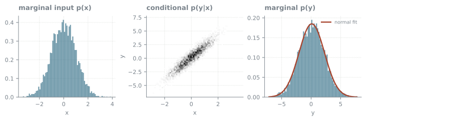
\(y = 2x + 0.1 + \varepsilon\), with normal input and normal noise.
Code
x = rng.standard_normal(n)example_plots(x, 2* x +0.1+0.75* rng.standard_normal(n))
The response looks clearly normally distributed.
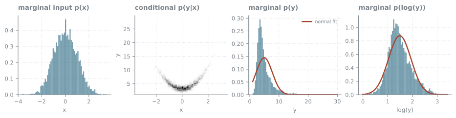
\(y = 2x^2 + 3 + \varepsilon\), with normal input and normal noise.
Code
x = rng.standard_normal(n)example_plots(x, 2* x **2+3+0.75* rng.standard_normal(n), with_log=True)
Neither \(p(y)\) nor the marginal of \(\log y\) looks normal, although the conditional \(p(y|x)\) is a normal distribution with mean \(2x^2 + 3\).
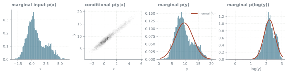
\(y = 2x + 8.1 + \varepsilon\), with normal noise, but a mixture of two normal distributions as input.
Code
x = np.concatenate([rng.standard_normal(3* n //4), rng.standard_normal(n //4) +3])example_plots(x, 2* x +8.1+0.75* rng.standard_normal(len(x)), with_log=True)
\(p(y)\) has a second bump and does not look normal, even though the conditional \(p(y|x)\) is normal with a mean that depends linearly on \(x\). The marginal of \(\log y\) looks close to normal, which would suggest a transformation the model does not need.
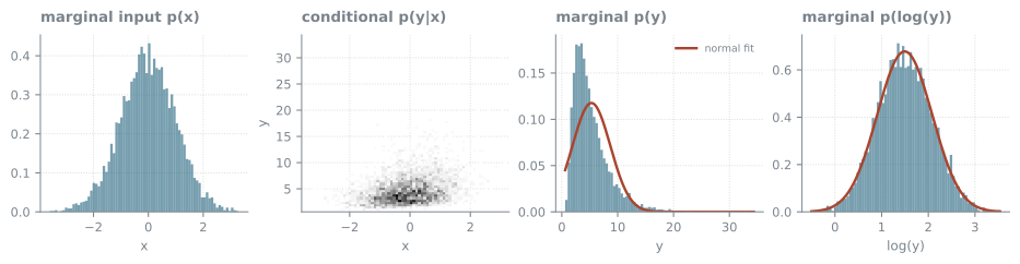
\(y = 2.1^{x/4 + 2 + \varepsilon}\), with normal input and normal noise. The conditional is not normal, because \(\varepsilon\) appears in the exponent.
Code
x = rng.standard_normal(n)example_plots(x, 2.1** (x /4+2+0.75* rng.standard_normal(n)), with_log=True)
The marginal of \(\log y\) looks normal.
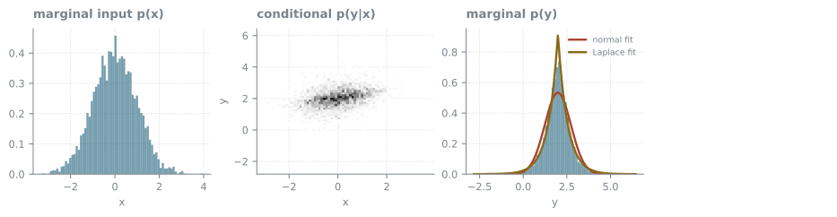
\(y = x/4 + 2 + \varepsilon\), with normal input and Laplace noise.
Code
x = rng.standard_normal(n)example_plots(x, x /4+2+ rng.laplace(0, 0.5, n), with_laplace=True)
The Laplace fit matches \(p(y)\) better than the normal fit, because the noise is much larger than the spread that \(x/4\) adds.